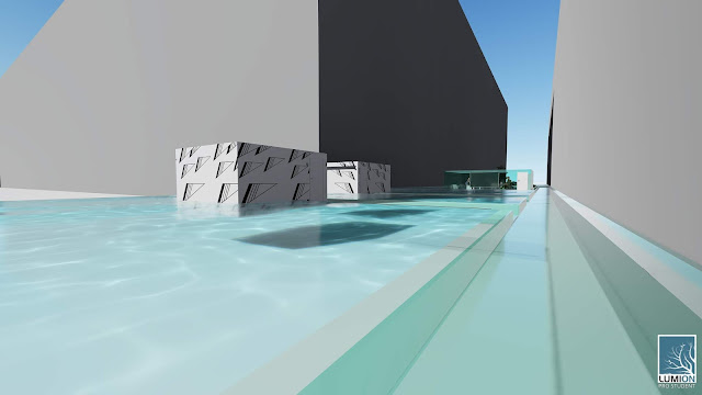
The link I’ve read is
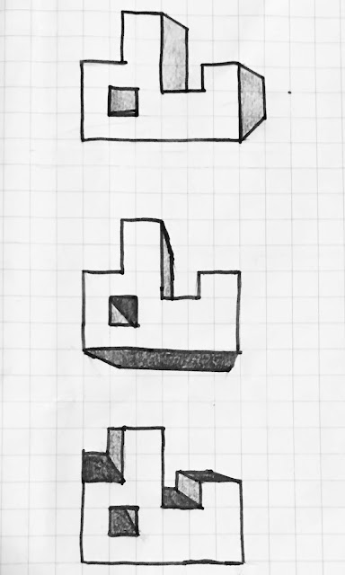
The plan I consulted is the one below.
Being inspired by this plan, while designing my bridge, I placed 2 large and focused functional units, the lecture, office and storeroom pavilion and the gallery at center and arranged other functional units around them. Being similar to above plan, in my bridge, some secondary units are also linearly arranged.
Being inspired by this plan, while designing my bridge, I placed 2 large and focused functional units, the lecture, office and storeroom pavilion and the gallery at center and arranged other functional units around them. Being similar to above plan, in my bridge, some secondary units are also linearly arranged.
My Theory: Connection.
The link I mentioned just before is an introduction of swimming pool hanging between 2 skyscrapers. A particular attractive thing of it is that the water gives the pool an extremely lightweight sense and since it’s so clear, people feels like they are flying above the city while swimming. This is because the connection between the space inside the pool and outside the pool is connected with each other and be boundary between them is not obvious.
Being inspired by this point, I developed my project in a similar way and used the concept “Creating interesting connections ”.
This connection is reflected by the connection between my bridge and the context.
Firstly, this building connects both the square house and the building on the other side of the Anzac Parade. Users could go upstairs and enter this building from both side of it.
To certain extent, the boundary between indoors and outdoors as well as individuals inside and outside is removed. If the users look down, they can clearly see the cars and pedestrians below. If materials with satisfactory sound insulation is adopted, unexpected disruptions from the cars on the street can be effectively prevented. In evening, the artificial light in this bridge also could be seen by pedestrians and people in cars. The night scene is good. :-)
Secondly, this bridge is connected with natural surrounding. This could bee seen from the considerations of sunlight and ventilation.
Some pavilions has transparent ceilings and walls, which enables sunlight to come in. However, excess natural lighting is avoid for the units which have particular functions. For instances, the lecture theater and computer lab have non-transparent walls and ceilings because sunlight can be disruptive when multimedia and screens are being used. These non-transparent blocks also create a contraction with the reflective water surface.
Ventilations in each pavilion are carefully considered. For example, an effective ventilation is formed by the long narrow window in lecture theater, the air vents distributed evenly on two sides in lecture theater, the doors of storage room and administrative office and the row of glass windows in academic office. This ventilation is important since it helps to keep the lecture theater and offices cool and comfortable as well as keep the items in storage room cool and dry so that the items won’t become mildewed. Ventilation joins the architecture into the environment so the theory which is “connection” also be seen.
Thirdly, Almost every two individual functional units in this building is directly connected to each other. For instance, people don’t need to go across the library to access the lecture theater, which is convenient and time-saving for users.
Textures
The textures I adopted in the building are the ones below. I used Photoshop to improve them.
Rotation
Scaler
Radiation
Draft Lumion Image
Images for final Lumion model
1. In these Lumion images, some elements lost there materials. This is because if I want to show all the materials in Lumion, I need to explode all the elements in sketchUp. This in impossible for me because this it makes the computer crash. However, I managed to explode as much as I could. All the materials and details of my building are shown in my SketchUp model, please have a look.
2. All they glass elements are expected to be entirely transparent without the green colour. I added the colour just to make the glass elements visible and obvious.
3. The studio roomes should also have transparent glaze walls. They look white because of some unclear technical issues.
Five overview images
(View from Square House)
A. Lecture theatre
(With texture - Rotation)
B. Studio
C. Workshop
D. Computer Lab
E. Academic office
F. Administrative office
G. Research Space for Stuffs (Extra Seats Were Added in Case Guests Come)
H. Research Studio for stuffs (Extra Seats Were Added in Case Guests Come)
I. Meeting Room for Stuffs
G. Gallery
K. Meeting Room for students
L. Library
M. Bathrooms
Bathrooms near lecture theatre
(With texture - Scaler)
Bathrooms in Stuffs' Research Area
N. Lounge
(With texture - Radiation)
O. Storeroom
Other contents of this project is in file "Arch1101 Project 3"
Moreover, the blog published on 5.17 was also adjusted. Here is the link: Jiamei20180517


